Friday, 27 September 2013

Remembering


Got to day 51 at BL. Wow, I'm almost half-way through a course that actually finished five months ago. Go me.

This time the challenge was to use two of Kim's textures, Thursday and Yesteryear, and follow the recipe she gave on any image.

As the day I processed these photos marked the fourth anniversary of my father's death, I chose something that made me think of him as my first image. I took the photo when I was staying at father's flat after his death, helping my sister to clear it up. The flat never was a home to me, and only a few years to my father, but the objects there are soo familiar. I remember what meticulous care father took of the little flat, dusting and hoovering and tidying up and watering plants and washing each cup straight after use, and I remember teaching him to use the washing machine after mother died two years previously. There is the sofa and armchairs that used to belong to my grandmother and that father had reupholstered for her sometime in the seventies. There's the painting of the waterfall in our town - like all paintings in my parents' house, it was painted by an acquaintance. The painter was the boyfriend of our that time lodger, and I used to sit in their room and watch him paint and we'd talk about art. Father was very fond of the painting, me much less, but it was an essential part of the living room even in the old house. Here I followed Kim's recipe rather closely.

My Father's Living Room
Resources:
- textures Thursday & Yesteryear by Kim Klassen
- photo frame by Rita @ The Coffee Shop Blog
- background paper Close to Ground 05 by myself

The second photo I tried the recipe on was chosen for similar reasons. It is a shot from my parents' summer cottage window, our second home in my childhood. It belongs to my sister now, and I was visiting the cottage quite probably for the last time in 2010. The July evening was like countless others I've spent there, except for the fact that I've never before been there all alone, not even waiting for anybody to arrive. The view is not what I would have seen as a child - the trees have grown, others have been cut down, the garden swing is a newer one. But the sauna and setting sun and lake are the same, as is the old bathtub grandmother started using as a flowerbed and the whole feel of the place.

Remembering Childhood Summers


Resources:
- textures Thursday & Yesteryear by Kim Klassen
- framing action Simple px by Chain

I decided to try the recipe on a third photo as well. This is a recent one, I took it at the end of August when we were on our usual walk route with the dogs. I mainly wanted to see what the recipe would do to the blue sky of the original. Not bad. The feel is very much the same as in the previous image, although the originals differ quite a lot.

Path to River

Resources:
- textures Thursday & Yesteryear by Kim Klassen
- framing action Simple px by Chain

A Tall Order


For day 50 at Beyond Layers we were asked to show where we live, and shoot landscapes in portrait format. I often do that, and originally I thought I'd pick something from the archives again.

But I didn't. For this challenge I actually didn't delve into my archives but instead took some time to go for a little walk to get some images of where I live. Not of the garden, not the doggies, but some shots on the riverside in the town centre.

As the opportunity more or less offered itself, I took it, and feel so good about it. About a month ago, I went to buy meat for the dogs from the truck the stops here every four weeks, and it was such a beautiful August evening. So instead of rushing home with the boxes of frozen meat in the boot of my car I took a few steps towards the river and took the first photos.

Riverside from Market Place

Process:
- ran action CoffeeShop 2020 by Rita @ The Coffee Shop Blog
- lowered layer opacity to 80% and masked out from the bottom
- applied texture Havana by Kim Klassen
- inverted texture colour and changed blend mode to 60% Color Dodge
- ran framing action Shadow by Chain

Then I grew even bolder - I drove a bit further along the riverside, parked the car for about ten minutes and walked to a park to take some photos towards the centre. I "wasted" perhaps a full fifteen minutes there, but it felt like a huge achievement. Which in a way it was, because I had taken a step out of my oh so well set ways.

Riverside Sunset
Process:
- straightened image in ACR
- corrected white balance in ACR
- ran action Fresh & Colourful by The Pioneer Woman
- ran framing action Shadow by Chain

Thursday, 26 September 2013

Colour Storyboards


Beyond Layer challenge for day 49 was to make something Kim calls a colour-storyboard. She offered two tutorials to do this.

Following the first tutorial, I sampled colours from a bouquet I photographed in April. On our way home from celebrating Marjo's birthday, we visited this Home, gardening and interior design fair at Helsinki Exhibition and Convention Centre. One event there was a bouquet auction, and this was one of the bouquets on display.

Bouquet
The processing steps were pretty simple:
1 blurred image: Gaussian blur 26,0 px
2 masked out blur from the bouquet
3 ran action Springtime by NightFateActions
4 enlarged canvas and made swatches
5 applied pattern overlay to swatches

My take on the second tutorial already ended up in use: this photo of a rose turned into a thank-you card for my fb friends after my birthday. I loved the whimsical splatter brushes and thought they brought a nice touch to the otherwise calm photo.


Processing steps:
1 enlarged canvas
2 made colour splatters with brushes by Dustin Schmieding
3 added texture Sunkissed by Kim Klassen at color burn 42%
4 typed text in Finnish, font KG Somebody That I Used to Know by Kimberly Geswein
5 typed text in English, font Janda Elegant Handwriting by Kimberly Geswein
6 flattened image
7 ran framing action Shadow by Chain

Monday, 23 September 2013

Of Travelling and Knitting


The challenge for day 48 at Beyond Layers: to have a loved one photograph you doing something you might consider mundane. This one was meant to made us think about our special gifts, that whatever we create and touch is of value and important. Kim took pictures of her friend Myriam making a salad, peeling and dicing and so on.

Another aspect of the challenge, as I see it, was using our hands, and that made it easy for me to choose how to tackle this one with photos I already had: my knitting. I don't know if I see it as mundane, but I definitely am happy for finding it again, and I suppose it could be considered a gift?


Resources:
- template 25 by myself
- paper Happiest Search 05 by myself
- font SF Arch Rival by ShyFonts
- font Learning Curve Pro by Blue Vinyl Fonts
- brush Stitched Mess by Kim Klassen
- Post it sticker by Akizo

This layout actually meets another challenge demand, too: the photo of me grinning goofily and holding the finished sock was taken by my friend Marjo. The sock was a trial for a bigger project, to test out if I, who had not been knitting socks for the past thirty-five years or so, could knit some pairs of this pattern or not. I had the correct yarn for the pattern at home but not in the correct colours (grey, black and white) but who cares - the purpose was only to try out the pattern, and I had three colours anyway, orange, green and grey. So as we took a train to Helsinki to celebrate Marjo's birthday, I started knitting, and before we arrived back home, the sock was finished. The sock is actually rather crappy, but for a first effort after such a long time I'm mightily pleased with it. But no, I'm not going to knit more of them.

Which sort of brings me to the next layout. I got a new sock pattern to try out from my boss, and I really like it. She said it's a traditional Finnish pattern, and anyway, it's simple and pretty. These pictures were taken when I was celebrating the World Wide Knit in Public Day all by myself, knitting in public but without much more company than some cyclists, joggers, jackdaws, wagtails, thrushes and a heard-but-not-seen pheasant. The weather was wonderful and my knit-in-public days pleasant and relaxing.


Resources:
- template 26 by myself
- brush by Mouritsa
- paper Blue Jean 02 by myself
- font Denigan by Måns Grebäck


Polaroidish


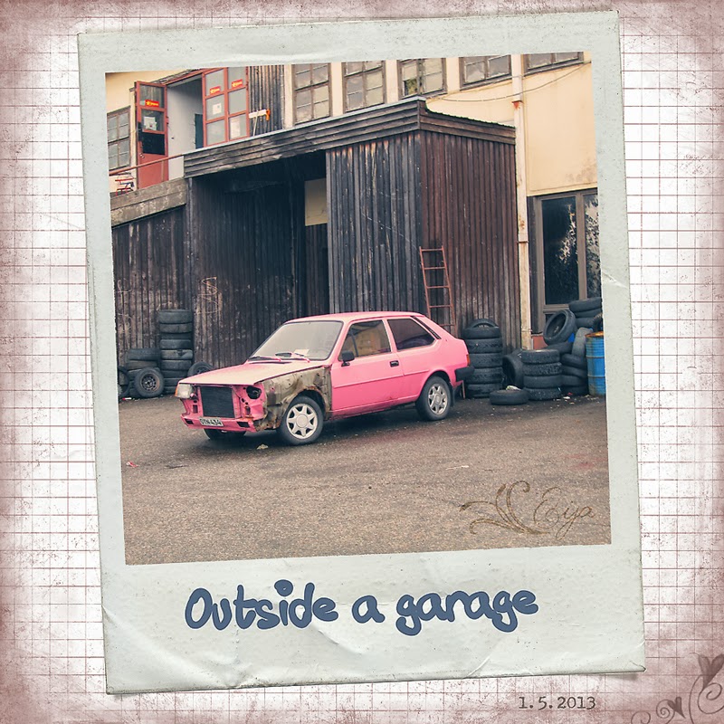
Day 47 at Beyond Layers was called Polaroid Love. I was somewhat suspicious of the theme to start with. We've never had a Polaroid camera in our family, so I really cannot say I'd love Polaroid. I do remember somebody we knew had this cool camera with which you could take these instant photos, but they never were that popular with the people we knew. But then I thought about it from another point of view: what I remember very well are the first colour photos from the 70s that started very soon losing their colours and turning red and faded, especially in the plastic pockets where we used to place them. I shudder to think my Granny's large album with all plastic pages, little pockets full of reddened photos, some almost impossible to make out anymore…

Furthermore, there seem to be these actions for that sort of effect - blur, fading colours - floating around, so I thought perhaps I'd now get to try out some of them within these polaroid frames Kim urged us to download. So I did try out various actions, with pleasing results. Then I dediced to turn them into scrapbooking layouts, and also got the opportunity to use some scrapbooking papers from the Au coin de l'objectif website, which I has been my favourite scrapbooking resource for years. It's a treasure trove, though nowadays I tend to make my own papers.

All these photos were taken on 1 May on the now already traditional Mayday orienteering event in town. It's a lot of fun. The local orienteering club places these about 20 check points around the town, the map with the points is published in the local paper, and people go around punching the checkcards also published in the newspaper at the check points. You can find as many points as you wish and in the order you wish, but if you punch your card at at least six points, you can return your checkcard and take part in a draw of some little prize. Some people take it as a sports event, running or jogging the whole route, but for many it's either a nice walk or a family cycling tour. We take a walk with the dogs and of course I take the camera along, since there's always something nice to see. I thought these pictures were well suited to this challenge, because they were sort of timeless, places that certainly had been there in the seventies. And now I'm even happier to have taken and played with the pictures, because two of the photos couldn't be taken anymore - the buildings have been pulled down this summer.


Resources:
- action Vanilla Peach by NightFateActions
- Polaroid frame by Fuzzimo
- paper from Bruissements d'un premier anniversaire by Au coin de l'objectif
- font Tusch Touch 1 by Måns Grebäck
- font Underwood Champion


Resources:
- action Dusty Haze by Sarah Lynn Cornish
- Polaroid frame by Fuzzimo
- paper from Bruissements de rentrée des classes by Au coin de l'objectif

- font Tusch Touch 2 by Måns Grebäck


Resources:
- action Vintage by  NightFateActions
- Polaroid frame by Fuzzimo
- paper from Bruissements de rentrée des classes by Au coin de l'objectif
- font Tusch Touch 4 by Måns Grebäck


Resources:
- action Seventies by The Pioneer Woman
- Polaroid frame by Fuzzimo
- paper from Bruissements de rentrée des classes by Au coin de l'objectif
- font Tusch Touch 3 by Måns Grebäck

Doesn't look too bad. Perhaps I'll do something like this later on, too.

Cups


Wow. Posting day 46 of Beyond Layers already. This time the challenge was to capture some cups during the week. I didn't use a week for this though - just one day.

First I thought I'd browse my archive, because I know there are some cups there, but then again, why not shoot some? So I grabbed the camera and went to my new small "studio" with a pile of mugs and started shooting. Taking many pictures of course meant I was going to scrapbook the results. Not to make the pictures tiny, I ended up making three layouts with the cups. Silly? Perhaps, but fun.  I was also rather self-sufficient this time, using my own resources, which makes me even more pleased with the results.

The first set was our dog-themed mugs, included are the Dandie Dinmont Terrier ones and some from special occasions: one from The European Winner Show in Helsinki 2006 and two from Helsinki Winner Show 2012.


Resources:
- texture Mute Light 01 by myself
- papers Cloudbusting 03, 04, 05 & 06 by myself
- template 22 by myself
- fonts Love Ya Like A Sister  &  KG Call Me Maybe by Kimberly Geswein

The second layout starts with unique handmade mugs made by a colleague of mine, a teacher of pottery. Then there is our wooden mug-stand, which I absolutely love, with yellow Teema mugs by Arabia. There are also our two Moomin mugs, my Little My and Better Half's Stinky, our plastic mugs for travelling and Glühwein mugs I got as a present from my German students.


Resources:
- papers Mellow Yellow 03 & 04 by myself
- stitches by Gunhild Storeide
- font Lavanderia by James T. Edmondson
- template 23 by myself

The third layout includes out two Russian tea sets and some rarer mugs, such as the hand-painted one in top-left corner.


Resources:
- papers Lemonade Stand 03, 04 & 06 by myself
- font Simply Glamorous by Brittney Murphy
- font Seaside Resort NF by Nick's Fonts
- template 24 by myself

That was a nice bit of work for a rainy day in July, in between typing dog show critiques.  It's only apt that I post it after the most rainy day I've ever experienced... it doesn't often rain here without a single break the whole day through, but it did yesterday.

Will be posting a pile of other challenges today as well, some of which have been sitting on the computer since July.

Wednesday, 18 September 2013

Kim's Lilacs and our Dog


I'm posting days 44 and 45 of Beyond Layers here. In the day 44 challenge I was to process a photo by Kim to my liking. It was a pretty bunch of lilacs, and Kim seemed to have desaturated and toned down the original. I took another way and added more contrast and sharpness. This seems to be my way: adding clarity where I can, using bright colours. With a few exceptions, I don't seem to be too good at creating dreaminess or toning down - perhaps it just isn't my thing.

Here are both of the images side by side.


Here's the steps I took:
1 added texture 294 by Sirius-sdz
2 blurred the texture: Gaussian Blur 8 px
3 changed blending mode to soft light 100%
4 ran action Fresh & Colourful by The Pioneer Woman
5 changed action group opacity to 34%
6 added texture Now by Kim Klassen at Colour Burn 76%
7 added frame
8 resized image

Next I'll be off to see Kim's recipe to how she processed her own photo, I guess.

******

As I anticipated, on day 45 Kim shared how she processed her lilac image herself. But I have to say, I was astonished to realize she was sharing with us a technique I had just used in my own processing of her image! I swear I didn't have a peek at the video beforehand, just ended up using Gaussian blur on the texture on my own.

Anyway I decided to have another go according to Kim's suggestions. I picked up a photo taken of our youngest Dandie Justiina, taken on 29 May this year, when she was a bit over a year and a half. She's like many Dandies we've had in that she'll often stare right at you and the camera when you're taking a picture. Often, that is. Usually not when you'd absolutely want her to.

Here I kept the added noise Kim suggested at a minimum, added Gaussian blur to the first texture so that it only gave me the lighting and none of the actual texture, then added another texture for a painterly effect.


Resources used:
- texture Cool Grunge by Kim Klassen at soft light 100%
- texture Paint on Canvas II by Kerstin Franck at overlay 77%
- framing action Double by Chain

What I didn't do here was adding type and then adding gradient to the text, that'll have to wait for some other time, perhaps when I do some scrapbooking?