Showing posts with label photography. Show all posts

Monday, 7 July 2014

Vases, Bikes, Summer Nights and Dogs


On day 64 of Beyond Layers, the challenge was to use a certain texture Kim posted and experiment with some masking tricks she shared. She gave a recipe, which I, for once, followed pretty closely without too much tweaking.  I did, however, add another texture. The photo was taken in April at the student exhibition at the community college where I work.

Pictures at an Exhibition - Vase with Birds
Resources:
- texture Jay by Kim Klassen
- texture Tin Type 1900 by Distressed Textures

The second picture dates from our annual camp with the Finnish Dandie Dinmont Terrier Club. Every summer we get together with other Dandie owners and have a fun weekend. The shot was taken on a cloudy and rather windy night by the lake, and I had a lot of fun post processing it rather heavily.

A Summer Night

Thank you for the textures:
- Distressed Textures by Denise Love @ 2 Lil’ Owls Studio
- Paper Pack 3 by dierat

In the third picture I once again returned to Zwolle, where, among loads of bikes, I found this very attractive feminine specimen, and processed with a texture of my own.

The Ladybike

Lastly there's a scrapbooking layout I made of our youngest Dandie Justiina. Originally she was just lying down on the grass, but the very moment I pressed the camera button she jumped up and rushed towards me to find out what it was I was doing. I have been viewing several layouts lately done in the artsy style, and here's my shot at it. I really enjoyed the creation process of this one.


Resources:
- background paper from paper pack I Can See Clearly Now by myself
- masks from Shadowhouse Creations Splatter Mask Set 2 by Jerry Jones
- brush from Moments 2 by Fran
- flowers from kit Bleu comme une orange by Fran
- stitches from Coutures/Stitches 1 by Fran
- text brushes by Aurorabor
- watercolour brushes by Ron Deviney
- splatter brushes by Robyn Cough
- font Jazz LET
- font Zapfino

Wednesday, 25 June 2014

Finding Shapes - Converging Lines

At last I've reached the last installment of the Finding Shapes challenge. What I have this time are converging lines. The first one is just another brick wall, but I really liked the unexpected contrast of two colours of tiles and then the fence on top. Here I applied two texture layers to change the mood of the picture into something a bit more dramatic.

Another Brick, Another Wall

Resources:
- textures from Delicate Paints Textures and Vintique Fine Art Textures by Denise Love @ 2 Lil’ Owls Studio

Next I have here yet another shot from Salzburg, under the same bridge by the River Salzach that I have posted a layout of earlier. I did some adjustments in Lightroom and then textured the picture lightly.

Under the Bridge

Resources:
- texture from The Grey Collection by Denise Love @ 2 Lil’ Owls Studio

In the third picture I'm again by a river, this time the Trave in Lübeck. I shot the picture in May 2012, but the title and the treatment of the photo arise from the fact that I remembered clearly standing at the same spot in the 1980s, when me and Better Half were visiting the city together. Here I was trying to achieve an old, soft and faded look, and processed and textured accordingly.

Remembering

Resources:
- textures from The Stained Collection and The Creative Black Mask 2 Collection by Denise Love @ 2 Lil’ Owls Studio

The last picture this time is sort of me drawing a conclusion of the shapes  challenge - in addition to converging lines, there are squares, rectangles and circles in the photo. This one was shot in Vienna, at the railway station in Schönbrunn. We had arrived from Salzburg that day and were taking a flight back home the next day, but there was time enough to go and visit the Schönbrunn Castle. The station itself was a very nice mix of old and new. Here I applied gently two textures by Sirius-sdz.

Auf dem Bahnhof

Resources:
- textures from Texture Pack 3 and Texture Pack 9 by Sirius-sdz

Monday, 23 June 2014

Finding Shapes 2 - Rectangles

Didn't I know this from my writing days - I really can go on tweaking anything I create forever, if I don't simply post it somewhere and call it finished. I used to write and rewrite and rewrite a little poem again and again, literally for years, and now I notice I'm doing the same to my pictures. So it's high time to post these pictures off and be done with them and tackle something new.

I took the first picture in May 2012 while travelling towards Scotland with my students. We stayed overnight in Zwolle, and I found this pretty door on our evening walk in town.

Red Door

I layered the picture with texture Waterfront 17 by Kim Klassen altogether four times with various blending modes, masking off various sections of the texture on each layer.

The second picture dates from the same trip. This time we were heading back home and walked about in Lübeck, waiting to take our boat home across the Baltic Sea. It's just another office building somewhere in the city centre, but I found it attractive, especially how the top floor windows reflected the blue sky and the ones downstairs remained black, but also other contrasts, such as the elaborate 19th century door frame and the modern door with company logos.

Looking at the sky

I started processing this photo as another textured image, but was never quite satisfied with it. Then I revisited some digital scrapbooking sites and ran across these techniques of making a photo look part like a drawing, part like a painting. Tried it, and still wasn't quite happy with it, so I went on to try out another new technique, using frames but painting partly outside the frame. These techniques are certainly something I'm going to play with later on, too.
 Resources:
- Brushes & frame
- Brush stamp 
- Papers 
- Font 1
- Font 2 

The third picture is from Salzburg, on a trip we took to the World Dog Show immediately after my trip to Scotland. We walked along the Salzach under a bridge, and high up there was this cage, for maintenance, I suppose.


Kein Eintritt

This one was created much like the one above: I started by texturing the photo, then decided needed a frame, then decided I'd make it into a scrapbooking layout. *sigh* Now I'm letting go of it. No more tweaking.

 Resources:
- texture Cool Grunge by Kim Klassen 
- mask by Julie Mead Designs
- background paper from paper pack Green Finch and Linnet Bird by myself
 - font Dusty Rose NF
- font Mary Helen JF

Wednesday, 4 June 2014

Finding Shapes 1 - Squares

Beyond Layers day 63 challenge was to find and photograph geometric shapes. The first shape was a square. Here I'm posting two square pictures.  The first one was taken in February when we were rehearsing for our Easter week performance of Stabat Mater. These are windows in the Suomussalmi church. There was beautiful light, but I needed to lighten and smooth the image up, so I applied a bokeh texture.

Winter Light
Resources:
- texture from October 2012 Bokeh Set by Jerry Jones @ Shadowhouse Creations

The second photo was taken at the Gallery of Modern art in Glasgow. All in all, I found the building itself far more interesting than the exhibitions at the time I visited the gallery. To match the flowing shapes in the windows, I applied a texture to give the same kind of effect to the rest of the photo.

Blue Window
Resources:
- texture from Creative Black Mask 2 Collection by Denise Love @ 2 Lil’ Owls Studio

Wednesday, 7 May 2014

Pieces of Me, Days 4 & 5

I'm posting some pictures to the originally one-week Beyond Layers challenge Pieces of me. This'll be the last installment in the series. On the fourth day the topic I chose was A Light Fixture.


The light in the first picture is one of many at my work place, they are all over the building, along corridors and in the concert halls. I think they are lovely in their clarity and simplicity, they create a beautiful play of light and shade against the white walls. The picture was taken on a  typically dark Friday afternoon last December when I was walking the corridors and thinking how I longed for more light, and how the days would still continue to grow shorter.


Resources:
- font Denigan by Måns Grebäck


The challenge for the second photo was a favourite beverage. Well, I have many, tea being the everyday favourite. This one is a sort of festive variety, Chai Latte - I first tasted it a couple of years ago in Britain and have since discovered it is to be had in Finland as well, but unfortunately not in my home town, so I can only have it when travelling. This particular drink was enjoyed at Birmingham Airport on our way back home from the Crufts Dog Show in March 2013. It still makes my mouth water.

Resources:
- font Chopin Script by ClaudeP
- brush by Coreaux 
- texture Soft and Sweet by Kim Klassen

The third photo was brought aboout by the prompt Through your window. The squirrel seated on the roof of our woodshed is one of at least eight that have frequented our bird feeding post this winter. They still hang around, since we still feed the birds, because the nights are so cold, below zero almost every night. Now they have started to change colour, most of them are wearing their summer clothes and have turned red or at least reddish.

Frequent Visitor

Resources:- texture Revolution by Kim Klassen

Sharing at Texture Tuesday

Thursday, 24 April 2014

Pieces of Me, Day 3

Another picture post to the originally one-week Beyond Layers challenge Pieces of me. On the third day the topics were Kitchen faucet and Your front door.

The first image needs little explanation. It's the kitchen faucet installed in our kitchen at the time our house was built 11 years ago, very typical in Finland. I still love the tiles we chose for the wall.


Photo taken on 23 February, 2014.

Resources:
- ribbon by Mediamilitia
- texture Waterfront 19 by Kim Klassen
- font Janda Elegant Handwriting by Kimberly Geswein

The second photo dates from last autumn. Without the chrysanthemums, it could have been taken last weekend, or any weekend when we have no longer or not yet snow. Just like yesterday, on a day off we like to work in the garden doing this and that, and the dogs keep watch. They sit or lie at the door, on the lawn, under the trees, occasionally even in the flower beds and let us know immediately if any suspicious-looking strangers try to pass by our yard in cars, on motorbikes or bikes or, horror of horrors, on foot.


Photo taken on 12 October, 2013


Looking at the picture more closely, now I actually notice another thing that tells this is an old photo. The girls (Justiina at the bottom left, Marleena at the top right) nowadays look much more adult. 

Resources: 

 - texture Empty Page by Kim Klassen 
- paper Wineberries Dogwood and Tea 03 by myself (coming soon)
- font Sweetly Broken by Brittney Murphy Design
- PhotoMask 53 by Julie Mead

Sunday, 6 April 2014

Pieces of Me, part 2


These pictures are for the second part to the originally one-week Beyond Layers challenge Pieces of me. The topics for day two were Your Breakfast and The Mailbox.

For once, I actually took the photos for the challenge and didn't dig into the archives. The first one was taken at breakfast table - would have liked to have a photo with the doggies lurking at the background waiting for their morning cucumber (they're crazy about it). But as usual, when you want them to be there, they are not, or else they are running circles at such a pace that there's no hope of catching them with the camera. So it was our breakfast only.


Photo taken on 10 November, 2013
Resources:
- texture Carnevale 26 by 2 Lil' Owls
- font Snell Roundhand


The second picture shows the row of mailboxes where ours is, too, seen from the mirror of my car when I went to fetch the post. Wanted to have a photo without showing any of the names of the neighbours, and this way the mailboxes were suitably blurred.


Photo taken on 27 November, 2013

Saturday, 22 March 2014

Pieces of Me, Day 1


Changed my username on deviantArt, so I thought I'd create a new blog here as well. It seems I'm not primarily posting scrapbooking layouts, as I thought I would when I first started, so I felt  it a bit restricting to call myself ScrapEija. Now I'm Eija Ite (or Eijaite), exactly as on flickr, and happy with that, since it means Eija Herself. Life's busy, but I have managed to steal some time for photos and for Beyond Layers, which of course has been long officially over, but I'm going to plod along and only then tackle Beyond Beyond. That naturally means that particular course will be long over, too, before I have any chance to work on it, but so be it then. I'll do what I can when I can and am not going to stress over it.  I'm a bit sad to have missed the community side of it, but glad to have met nice people anyway in Blogland.

The pictures I'm posting this time are my take on the originally one-week BL challenge Pieces of me. There were two topics for five days, and I've covered at least one of them for each day. Here's my Day 1 challenge.

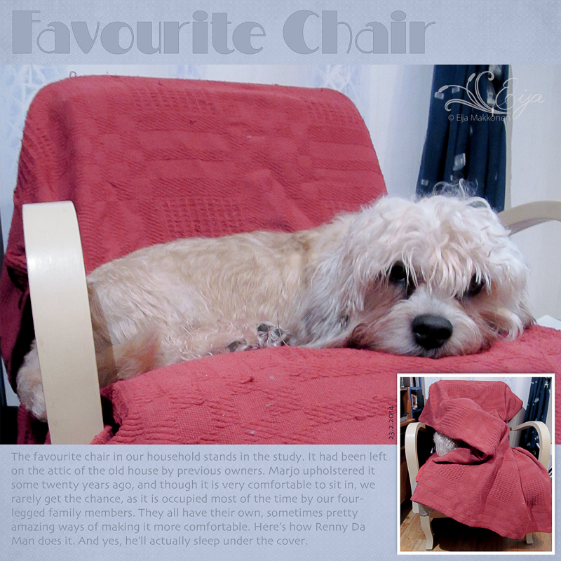
Favourite Chair

Resources:
- paper Blue Jean 02 by myself
- font Milton Burlesque NF by Nick's Fonts
- font Skia

The pictures show our Dandie Dinmont male Renny in his favourite chair in our study. I took the picture on in February, but it could be anytime (for example right now). Yes, he is in the small picture as well, hidden under the cover.  He might sleep for a good while under the cover, but at some point it gets too hot there and then follows the really fun part, when he starts manouvering himself out. You see a wriggling, twisting blanket, then it usually falls down and some feet appear under it, then after some shaking and puffing, out dives a dog on a bad hair day. This is a favourite chair, though, because there's almost always somebody there, at least whenever either one of us two-legged family members are in the study.

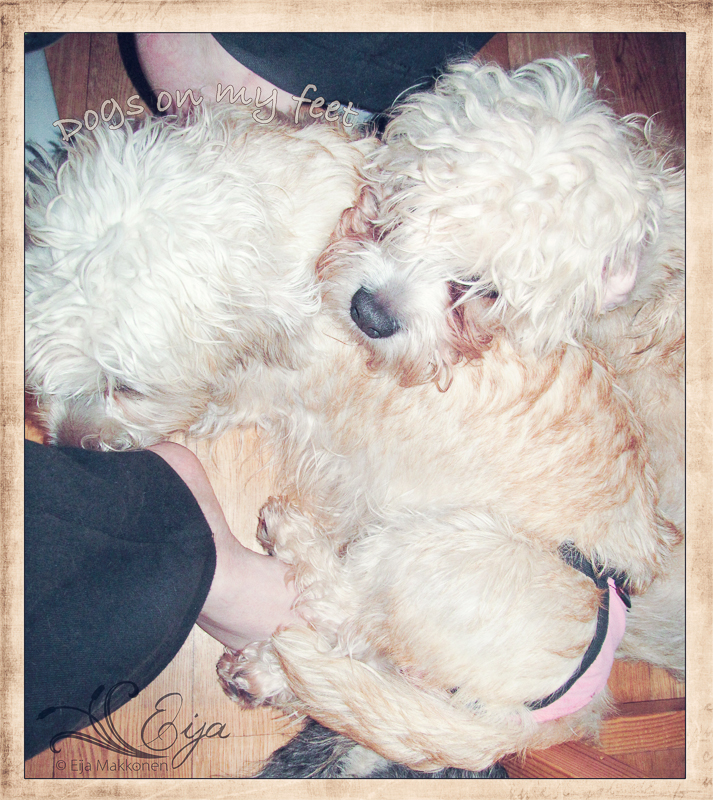
Another challenge for day 1 was On My Feet. I couldn't decide which one of these picture I prefer, so I'm posting both. The first one shows another favourite spot of the doggies in the study: lying on the feet of the person sitting at the computer. Here we have Renny and his daughter Marleena, while I'm typing this the one warming my toes is Grandmother Foxy.

Dogs on my feet
Resources:
- background texture Scripted by Kim Klassen
- font Bradley Hand ITC

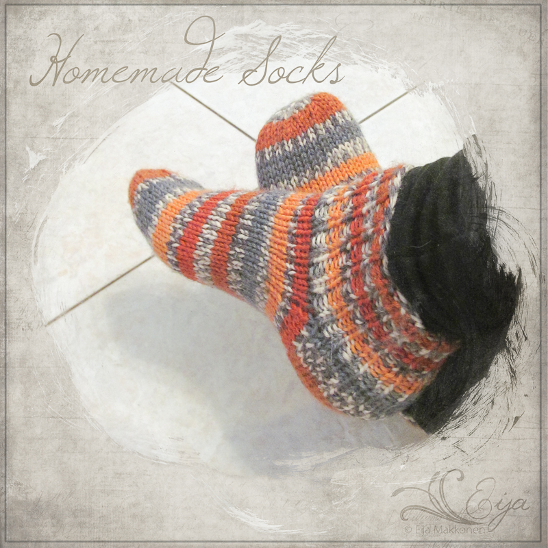
My other take for the challenge is a picture I took of my feet in socks knitted by Marjo last autumn. They have been my favourite footwear at home this winter. I blended two textures by 2 Lil' Owls on the background and used this lovely brushed mask by The Scrappin Cop on the photo.

Homemade Socks


Resources:
- textures Carnevale 45 & Vintique 5 by 2 Lil' Owls
- mask by The Scrappin Cop
- font Windsong by Bright Ideas

Saturday, 19 October 2013

Withered


So now we have snow. Although it's now lighter and not pitch-black in the evening, I'm not feeling overly delighted about. I guess I might be happy about it if I didn't know that it'll be there now for the next six months. Yes, it might melt away for a while, but it'll be back, and the melting away is almost worse - although I don't love it, I don't dislike snow as such, but I do dislike slushy roads, slippery roads, icy roads and streets.  Also this means we'll be ploughing and shovelling snow for months and months. Better Half already did the first take yesterday afternoon, and today it was my turn to start. Again, it's not too bad, I actually like it, when it's not too heavy and wet and there's not too much of it, but it's the fact that you have to clear the snow, whether or not you have the time or inclination, if you are to move at all…

I'm off work for almost a week now. Might perhaps get a challenge or two done? Today I cleared one: day 60 at BL. Before I got so far, however, I did some serious pruning in my photo archives from this and last year, and got rid of about a thousand photos, and am feeling awfully accomplished. I got myself Lightroom last month, and don't regret it - it made doing away with the photos so much easier, although I'm only just beginning to learn to use the program.

Anyway, day 60 challenge at Beyond Layers was to use some scripted textures and follow another recipe by Kim. I was not overly enthusiastic about using the scripts on top of the images as such, but I thought I could do something with them if I found the right image. (Read: a photo with enough white space, not green, like most of my non-winter pictures…) So I dug up a picture of leaves that I took about a month ago when rummaging in our old house. The leaves have effectively mummified - they have been standing on the window-sill of our old abandoned house since before we moved away from there, and that was ten years ago. I did slight modification in Lightroom and then followed Kim's recipe as such, until the scripted textures. The first scripted one, Sonnet 2, I blurred at 25 px Gaussian blur, to get only the tone from it, no text. Then I added Sonnet Magic at blend mode screen but turned down the opacity to 68% and masked out most of the script. I didn't add any photo filters, although that was part of the recipe, since I found that would have taken away all depth from my photo.

Withered

Resources:
- texture Sienna, Sonnet 2 & Sonnet Magic by Kim Klassen

Now to see if there'e enough for the birds to eat, when their last feeding rush for the evening starts. They have been crowding our feeding post ever since we started feeding them almost two weeks ago, and I have a feeling I need to do a refill, although I filled everything up to the brim in the morning.

Friday, 11 October 2013

Fragile


Fun for Friday evening: tackled Beyond Layers challenge for day 59. Kim shared a recipe and three textures for us to try out. The problem (for me, at least) with these challenges is the huge amount of time it takes to decide which photo to process. Ordinarily, you'd start building with a picture. Now I'm always looking at the kind of processing done and trying to find a photo I imagine could benefit from it. I never find anything similar to Kim's examples, but somehow I always have to try to match it at least on some level.

This is the third picture I tried this particular recipe on. In the end, I of course tweaked the recipe, but at least I started with it and used the texture, called Paper-Stained Music.


Fragile, c'est son nom
Resources:
- texture Paper-Stained Music by Kim Klassen

I took the photo in May in my little makeshift "studio". I have no idea what these flowers are called, but they opened beautifully from a bell-shape to this translucent disc, after standing for about two weeks in a vase. They were the last of the bouquet to survive.

The text on the picture just plopped from somewhere, when I was staring at the beautiful fragility of the flower on my screen. "Fragile, c'est son nom" I thought, and remembered things I did'nt know I remembered - it's a song by Patrick Juvet, which I suddenly remembered, too. Must be from somewhere early 1980s - the album was called Reves Immoraux, if I remember correctly. I think we had it on a C-cassette. I love how these things pop up, although I've been listening to Baroque Arias sung Andreas Scholl and Patricia Petibon the whole evening.

Sharing at Texture Tuesday.

Saturday, 5 October 2013

Painting With Light


On day 58 at Beyond Layers Kim challenged us to watch another video lesson and either try the technique on a photo by her or on our own image, and of course I went for a photo of my own. The topic of the video was how to use light to draw focus on a subject.

With the dogs snoring around me this Saturday morning, I picked up a photo and started to process, following Kim's suggestions. This time I took a photo of Da Man about a month ago. He was sitting and watching by the back porch, with a dried yarrow funnily framing his face. Again, Kim's picture and mine were so different that I didn't create the effect she did for hers, but I do like what I got out of this picture with the recipe.

Dog and Yarrow
Photo taken on 7 September, 2013.

Resources:
- texture Heartfelt by Kim Klassen

Sharing at Texture Tuesday.

Friday, 4 October 2013

Quote Challenge revisited


After a good while, I decided I'd play along the quote challenge from Beyond Layers day 39 anyway. I had already had a look at some quotes, so I went back and did some digging for photos. Seeing the results, I'm happy I did.

First Tulips

A picture of the first tulips pushing up, taken on 2 May 2013. Thought the quote was pretty apt for the image. The prompt word was "life".

Resources:
- font KG Ways To Say Goodbye by Kimberly Geswein

Sleepers

The quote challenge word was "peace". This made me think of our latest little puppies when they were little puppies, in this picture less than a month old.

Resources:
- textures from Shadowhouse October Square Texture Set 2 by Jerry Jones
- font Learning Curve Pro by Blue Vinyl Fonts


Foxy - Indian Summer

On reading the prompt word "change" I knew immediately what my quote would be: Dorothy Parker's poem Indian Summer. Ever since I first read it I've loved the poem. And I roughly knew what I wanted to do with the images, too - originally I associate the poem with our second-ever Dandie, Veera, whom we called Madame, because she was very dignified, self-assured and definitely not one to fool with. She was a businesslike, no-nonsense personality, but charming. However, since she left us years before the age of digital cameras and even the scans I have of her are not of very high quality, the dog in the photos is our present Madame, called Foxy. Totally different, with a lot more sense of humour (yes, Dandies come equipped with that), but certainly a lady who knows what she wants, who turned nine this week. In the last picture, by the way, she is not growling but actually smiling.

Resources:
- template 018 by myself
- background papers from paper pack Green Finch and Linnet Bird by myself
- font Lavanderia by James T. Edmondson

By The Frozen River
The fourth prompt was "intentions" and for this, the Douglas Adams quote was my absolute favourite. It's so true for me in so many ways. The picture shows my home town since 1987, where I definitely didn't plan to move. When I first went to study, I somehow thought I'd end up in the south, Helsinki or thereabouts. And here I am, 600 kilometres north, and have been happy here for more than a quarter of a century. Oh my. I took the picture on a walk in the centre on 1 May this year. Yes, it was pretty cold.

Jackdaws

The last prompt was "focus". I like the quote, and the photo is one of a series I managed to take on 8 June of a gang of Jackdaws, who landed on the grass and  were a bit shy of me, obviously thinking the treat on the ground might belong to me. They circled around, trying to appear nonchalant and uninterested, until one of them started the approach. Unfortunately none of the photos I took of the actual attack turned out any good but well, that's life, right?

Friday, 27 September 2013

Instagram-ish


At BL day 54 was declared Instagram day. This old fart had to dig up what that meant. Instagram seems to be this online photo-sharing thingy where you upload your phone pictures and apply some filters on them. Oh and all the pictures are square. I tried it out, but couldn't for the life of me figure out how to use it on the browser. Obviously it's meant to be used only by phone, so I decided it wasn't for me. Anyway, for the challenge we were to try out some instagram-ish photoshop actions on our photos, and there was a scavenger hunt as well. As you might expect, I did the hunt in my archives again, but restricted myself to using photos from last summer only.

Also, when I started playing with the actions Kim suggested we use I was not awfully impressed by the way they were made - they didn't open a new document, as many, or create the action as editable layers, as many others I've used, so I had to use the history tool to go back to the original if I wanted to try out the action. Sure gave me good practice in using the history tool! In the end I decided I wouldn't be using only the given actions but some others, too.

There were five themes for the scavenger hunt: something pretty, something blue, something borrowed, water and dreamy. For the pretty one I chose a picture I took on my birthday as we were driving back home from Helsinki. We stopped at this new lay-by service place, and they had this little thing we call maitolaituri in Finnish. Literally you could translate it as "milk jetty" - it was a place where the farmers would leave their milk churns by the roadside where they could be collected by the dairy deliverers. There are none in that use anymore, but I thought this thing, although new and non-authentic, was pretty and nostalgic and definitely worth a photo.

Something Pretty

Resources:
- Instagram filter action by Daniel Box
- framing action by Paint The Moon

My "something blue" photo is a photo taken by the river on a walk with the dogs.

Something Blue

Resources:
Instagram filter action by Daniel Box 
- framing action by Paint The Moon


For "something borrowed" I chose a photo of our dandie Justiina, whom our friend Nunnu borrowed to cuddle with. I photographed them after the ring at the Terrier Specialty show, basking on the grass in the sunshine.

Something Borrowed
Resources:

Instagram filter action by Daniel Box 
- framing action by Paint The Moon


The next prompt was "water". I had two I liked and couldn't decide which picture to choose, they were so different but they go well together. They also reflect well the difference between the dandies in them, the two sisters Justiina and Marleena. Justiina is approaching the water carefully and suspiciously and barely wets her nose there, whereas Marleena happily wades in the water, enjoying the refreshing coolness on a warm day. What the picture doesn't show, however, is her constant rushing in and out of the water. She has recently discovered that one can actually play in the water, but her sister still thinks water is only good for drinking.
 
Tasting the Water
Resources:

Instagram filter action by Daniel Box 
- framing action by Paint The Moon


Wading in Water

Resources:- CoffeeShop Vintagram action by Rita @ The Coffee Shop Blog

- framing action by Paint The Moon


The last prompt was "dreamy". Here I ended up choosing two images taken in Lappajärvi during our DDT Club Show and summer camp at the beginning of August. The first photo is of a folly right on the lake shore, the other one is a shot to the lake - originally I tried to shoot the gull sitting on the navigation mark, but it turned into a shot of the type "there-is-a-gull-there-just-try-and-spot-it".

Folly on the Lake

Resources:
- action Watermelon Blues by Sarah Lynn Cornish

- framing action by Paint The Moon


Lakeshore Rushes

Resources:
- action Pretty Hazy by Sarah Lynn Cornish

Instagram filter action by Daniel Box 
- framing action by Paint The Moon


Lots of dogs and water in these pictures. Yes, we had a nice summer.

More fences


The challenge of day 53 at BL was to watch a video lesson and try it on an image by Kim. I didn't see much point in simply copying what she had done, so I went straight to the second part, testing the recipe and techniques on an image of my own. It wasn't actually a spoken part of the challenge, but the underlying idea seemed to be fences, so I decided to try the techniques on a fence image.

First I found a fence picture related to my previous post about our re-fenced yard last autumn. It's a photo of the fence on the northern side of our yard after some snowfall last December. Tried Kim's techniques here, but not the recipe, since warming up a snowy picture didn't feel like a good idea.

Snowy Fence
Resources:
- framing action Simple by Chain

So I had to dig into the archives again, but after a while I found exactly what I needed: a photo of a fence around a church in Lübeck, photographed in May 2012. The dark fence against the red brick of the church was well suited for the warming and reddening Kim did in her recipe, so I used Kim's recipe almost as such, with minor adjustments, and followed the techniques as well.

Fence in Lübeck
Resources:
- texture Pumpkin Grunge by Kim Klassen

- framing action Simple by Chain


And on to posting the next challenge. I'm determined to get all this stuff posted so I can start working on something new.

Remembering


Got to day 51 at BL. Wow, I'm almost half-way through a course that actually finished five months ago. Go me.

This time the challenge was to use two of Kim's textures, Thursday and Yesteryear, and follow the recipe she gave on any image.

As the day I processed these photos marked the fourth anniversary of my father's death, I chose something that made me think of him as my first image. I took the photo when I was staying at father's flat after his death, helping my sister to clear it up. The flat never was a home to me, and only a few years to my father, but the objects there are soo familiar. I remember what meticulous care father took of the little flat, dusting and hoovering and tidying up and watering plants and washing each cup straight after use, and I remember teaching him to use the washing machine after mother died two years previously. There is the sofa and armchairs that used to belong to my grandmother and that father had reupholstered for her sometime in the seventies. There's the painting of the waterfall in our town - like all paintings in my parents' house, it was painted by an acquaintance. The painter was the boyfriend of our that time lodger, and I used to sit in their room and watch him paint and we'd talk about art. Father was very fond of the painting, me much less, but it was an essential part of the living room even in the old house. Here I followed Kim's recipe rather closely.

My Father's Living Room
Resources:
- textures Thursday & Yesteryear by Kim Klassen
- photo frame by Rita @ The Coffee Shop Blog
- background paper Close to Ground 05 by myself

The second photo I tried the recipe on was chosen for similar reasons. It is a shot from my parents' summer cottage window, our second home in my childhood. It belongs to my sister now, and I was visiting the cottage quite probably for the last time in 2010. The July evening was like countless others I've spent there, except for the fact that I've never before been there all alone, not even waiting for anybody to arrive. The view is not what I would have seen as a child - the trees have grown, others have been cut down, the garden swing is a newer one. But the sauna and setting sun and lake are the same, as is the old bathtub grandmother started using as a flowerbed and the whole feel of the place.

Remembering Childhood Summers


Resources:
- textures Thursday & Yesteryear by Kim Klassen
- framing action Simple px by Chain

I decided to try the recipe on a third photo as well. This is a recent one, I took it at the end of August when we were on our usual walk route with the dogs. I mainly wanted to see what the recipe would do to the blue sky of the original. Not bad. The feel is very much the same as in the previous image, although the originals differ quite a lot.

Path to River

Resources:
- textures Thursday & Yesteryear by Kim Klassen
- framing action Simple px by Chain

A Tall Order


For day 50 at Beyond Layers we were asked to show where we live, and shoot landscapes in portrait format. I often do that, and originally I thought I'd pick something from the archives again.

But I didn't. For this challenge I actually didn't delve into my archives but instead took some time to go for a little walk to get some images of where I live. Not of the garden, not the doggies, but some shots on the riverside in the town centre.

As the opportunity more or less offered itself, I took it, and feel so good about it. About a month ago, I went to buy meat for the dogs from the truck the stops here every four weeks, and it was such a beautiful August evening. So instead of rushing home with the boxes of frozen meat in the boot of my car I took a few steps towards the river and took the first photos.

Riverside from Market Place

Process:
- ran action CoffeeShop 2020 by Rita @ The Coffee Shop Blog
- lowered layer opacity to 80% and masked out from the bottom
- applied texture Havana by Kim Klassen
- inverted texture colour and changed blend mode to 60% Color Dodge
- ran framing action Shadow by Chain

Then I grew even bolder - I drove a bit further along the riverside, parked the car for about ten minutes and walked to a park to take some photos towards the centre. I "wasted" perhaps a full fifteen minutes there, but it felt like a huge achievement. Which in a way it was, because I had taken a step out of my oh so well set ways.

Riverside Sunset
Process:
- straightened image in ACR
- corrected white balance in ACR
- ran action Fresh & Colourful by The Pioneer Woman
- ran framing action Shadow by Chain

Thursday, 26 September 2013

Colour Storyboards


Beyond Layer challenge for day 49 was to make something Kim calls a colour-storyboard. She offered two tutorials to do this.

Following the first tutorial, I sampled colours from a bouquet I photographed in April. On our way home from celebrating Marjo's birthday, we visited this Home, gardening and interior design fair at Helsinki Exhibition and Convention Centre. One event there was a bouquet auction, and this was one of the bouquets on display.

Bouquet
The processing steps were pretty simple:
1 blurred image: Gaussian blur 26,0 px
2 masked out blur from the bouquet
3 ran action Springtime by NightFateActions
4 enlarged canvas and made swatches
5 applied pattern overlay to swatches

My take on the second tutorial already ended up in use: this photo of a rose turned into a thank-you card for my fb friends after my birthday. I loved the whimsical splatter brushes and thought they brought a nice touch to the otherwise calm photo.


Processing steps:
1 enlarged canvas
2 made colour splatters with brushes by Dustin Schmieding
3 added texture Sunkissed by Kim Klassen at color burn 42%
4 typed text in Finnish, font KG Somebody That I Used to Know by Kimberly Geswein
5 typed text in English, font Janda Elegant Handwriting by Kimberly Geswein
6 flattened image
7 ran framing action Shadow by Chain

Monday, 23 September 2013

Of Travelling and Knitting


The challenge for day 48 at Beyond Layers: to have a loved one photograph you doing something you might consider mundane. This one was meant to made us think about our special gifts, that whatever we create and touch is of value and important. Kim took pictures of her friend Myriam making a salad, peeling and dicing and so on.

Another aspect of the challenge, as I see it, was using our hands, and that made it easy for me to choose how to tackle this one with photos I already had: my knitting. I don't know if I see it as mundane, but I definitely am happy for finding it again, and I suppose it could be considered a gift?


Resources:
- template 25 by myself
- paper Happiest Search 05 by myself
- font SF Arch Rival by ShyFonts
- font Learning Curve Pro by Blue Vinyl Fonts
- brush Stitched Mess by Kim Klassen
- Post it sticker by Akizo

This layout actually meets another challenge demand, too: the photo of me grinning goofily and holding the finished sock was taken by my friend Marjo. The sock was a trial for a bigger project, to test out if I, who had not been knitting socks for the past thirty-five years or so, could knit some pairs of this pattern or not. I had the correct yarn for the pattern at home but not in the correct colours (grey, black and white) but who cares - the purpose was only to try out the pattern, and I had three colours anyway, orange, green and grey. So as we took a train to Helsinki to celebrate Marjo's birthday, I started knitting, and before we arrived back home, the sock was finished. The sock is actually rather crappy, but for a first effort after such a long time I'm mightily pleased with it. But no, I'm not going to knit more of them.

Which sort of brings me to the next layout. I got a new sock pattern to try out from my boss, and I really like it. She said it's a traditional Finnish pattern, and anyway, it's simple and pretty. These pictures were taken when I was celebrating the World Wide Knit in Public Day all by myself, knitting in public but without much more company than some cyclists, joggers, jackdaws, wagtails, thrushes and a heard-but-not-seen pheasant. The weather was wonderful and my knit-in-public days pleasant and relaxing.


Resources:
- template 26 by myself
- brush by Mouritsa
- paper Blue Jean 02 by myself
- font Denigan by Måns Grebäck