Friday, 31 August 2012

Now Me


The challenge for Beyond Layers, day 25 was self-portraits. Most people seemed to cringe at having their photos takes, with the notable exception of my new friend Michele, who seems to be an old friend of mine. ˆ__ˆ

For me I think it's something I got so used to in childhood that it's just something quite normal. My father was the one who photographed us, the whole family, wherever and whenever. So there are all these lovely black & white photos of my sister and me at play  or posing in new dresses (I think we used to be mostly dressed up identically or at least matchingly until I went to school). Later on, I have these colour photos (that have partially faded red) of the family, including me, posing at a landmark or sight when we drove around the country, visiting distant relatives or just touring around for a holiday. I don't like each and every photo taken of me, naturally, who would, but then, why should I? I'm quite used to seeing myself in photos, good and worse.

Really the only problem I've had is quite contrary and has everything to do with the kind of attitude the Beyonders share. Since most people outside my old family seem to abhor being photographed, I developed this shyness… You know, since everybody's saying how horrible it is to be photographed, it really must be that. I've felt quite silly and forward and self-centered and attention-seeking and what not for actually LIKING the thing. It has taken me all these years to gather enough courage to actually ask Better Half to take a picture of me every now and then.

Anyway, the real challenge for me in this self-portrait thing now was the already familiar fact that I don't have a working camera at the moment. It must be much easier to do it with a tripod and things, but one can't really put a phone on a tripod. I managed to take some rather nice shots with the phone held in hand, though, and then remembered that Mac has this program-thingy called Photo Booth - you just sit in front of the computer and have your Mac taking pictures of you with the in-built camera when you click the mouse! Did that, but the light in our study is not really optimal for photography. It would have been so much nicer to have an outdoor picture, too, in the pretty autumn light. And in a flash I realised that we do have the Mac Book, too, which I promptly took for a little walk outside. The pictures are naturally tiny, but I solved this by making a scrapbooking layout with the little pictures. The additional challenge for day 26 of using either one of the  text brushes Kim gave us or her texture I Am were both met here as well. A little creative thinking goes a long way! Here's me, at 50 years, 1 month and 3 days.

Not perfect but all me!

Resources:
- texture I Am by Kim Klassen
- texture Green Haven by Kerstin Frank
- text brush from brush set Affirmation by Kim Klassen
- template adapted from Photobooth by Just A Storyteller
- gradient Rivendell 02 by ElvenSword
- action CoffeeShop 2020 by Rita @ The Coffee Shop Blog
- font Blokletters Balpen by LeFly Fonts

Thursday, 30 August 2012

Pastel Processing & Texture Tuesday


We were challenged to do some pastel processing on day 24 of Beyond Layers. I knew this was going to be difficult, as pastels are so not my style. I love colours, bright and clear, strong contrasts - it's not that I wouldn't admire softness and delicacy in the work of others, I just don't feel quite at home with pastels. I guess it's because in my own colours, I'm an Autumn: orange is my favourite colour, I love warm browns and yellows and reds, soooo not pastel.

So, the first problem was to find a shot I could even imagine turning pastel. I don't have a white room, all the rooms in our house are colourful, and I simply didn't feel like going into setting up the studio to photograph with the phone. I started processing several photos, ditched them, and finally ended up with these two, both of which are photos I've taken in spring 2010.

White Carnation
Resources:
- texture Paper and Paste by Kim Klassen
- texture Now by Kim Klassen
- font Lastwaerk Bold by Johan Aakerlund
- font Gondola SD - Swash by Steve Deffeyes

Merezeon Blossoming

Resources used:
- texture 61v1 by Sirius-sdz
- texture Sepia Canvas by SolStock
- font Lithos Pro by Adobe
- font Chopin Script by ClaudeP

Now both of these were a challenge, and I'm posting them now just to get rid of the endless tweaking. I've practised the techniques Kim showed us, and although the images don't show here as they do when I view them in Photoshop, I rather think that I did manage to create the soft vintage feel that was the aim of this assignment.

Oh, and although prompted, I didn't try out Radlab. Frankly, I can't see the point in getting a Photoshop plug-in toy that costs $150, which is a lot of money for me, and lets you click click click to make your photos fancy  - I'm doing photo processing for fun, not for a living. If I want something like that, there are countless very cool Photoshop actions available quite free, thanks to lovely people like The Pioneer Woman, Rita at the Coffee Shop blog, The Black Cat Photography, NighFate, Jae and Sarah Lynn Cornish, just to name my favourites. I'm sure this plug-in has its uses for someone actually working with photos for a living and wanting to save time, but I for one am taking this course to learn to use the tools that I already have.

Since the theme for Texture Tuesday this week was free & easy, meaning anything goes as long as there's one texture by Kim, I'm also sharing this post there. Who knows when I'll be able to participate again, for now I'll have to start learning a completely new rhythm of life again.


Wednesday, 29 August 2012

If not now, then when?


At Beyond Layers, day 23 challenge was to ask oneself "If not now, then when?" That's a tough one for me, always busy doing something but always postponing things as well. To list even part of the things I really should do Now would take all too much time and energy, I'm not going into that...

But actually, one of the bigger long-standing Nows that I have rather recently tackled is this blog. I'd never really used it although I had an account for years, and I'd always sort of been writing a journal in my mind. (The problem with that is, of course, that the thoughts will not stay there for more than a few hours at the most.) Now, after I took this course, I've started putting my blog to good use. Although I'm mostly just posting pictures, I'm still recording events for myself to remember and recall later on, and I feel awfully good about it.

Another Now is approaching -- we'll be attacking our accumulated fat again with Better Half, and this time I'll simply have to find time to do exercise as well. It's not a question of "keeping fit" for me, it's "getting fitter" as I haven't been doing anything for years. Funnily, I feel happy and confident about it, too.

Kim gave us a text brush to use, and here's what I did with it. I took a phone photo of the Saintpaulias at the living-room window, and played with it.

If not now...

Resources used:
- background paper Cold Spell 03 by myself
- texture Stamped Right 2 by Kim Klassen
- text brush If Not by Kim Klassen
- template inspired by Marjo @ legrenierdemarjo.canalblog.com (no longer online)

We've done something extraordinary already, as a matter of fact. As I was going to mow the lawn on Monday, it was sunny and I went to get my sunglasses from the car, a little bird suddenly flew right in front of me, somewhere from the old neglected lawn, nowadays an unruly meadow or something of the sort, next to the old house. As I looked into the direction it came from, I saw something red - the red currant bushes that have been totally neglected for years were shining with berries! So I went and told Better Half and we picked the four or so bushes empty right then and there. Well, not totally empty, must leave something for birds, they've been having all the harvest for years anyway. It didn't result to much, since the bushes are ancient and almost drowned in grass and weeds, but a few litres anyway, and it'll be nice to munch them with yoghurt for a few days.

It's a pity we aren't really into berry-picking, it's quite nice and relaxing. Then why aren't we? Most of the reason is the total impossibility of going out into the woods with the whole pack of dogs, if the intention is anything but giving them some exercise. The other part is our reluctance to go out into the woods without the whole pack - that'd be time wasted. Quite a dilemma, which means that we'll have to resort to buying frozen berries at the supermarket yet again.

Oh, and while picking the berries we saw something interesting neither of us had witnessed before. I noticed this moth sitting on a berry, and it was clearly sucking the liquid from inside the berry. It was fascinating to see the berry slowly collapsing as the moth fed on it. We'd never known they'd feed on anything but nectar. The larvae of course I had known might feed on fruit, but that the adult moths will drink berries? I'd somehow always thought that the wrinkled, dried berries one finds in the bushes had been tasted by birds, but it seems it was moths instead. Fascinating.

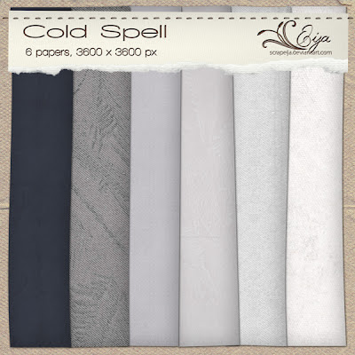
Paper pack Cold Spell

Click here to download the papers

Am again posting a paper pack that has been gathering dust on the computer. I used a paper from it recently and this reminded me to share this one.  Download by clicking on the preview image.

As before, it's all free, I have created them for my own use as scrapbooking papers, but you can use the papers / textures however you wish. Just please do not claim as your own, and please let me know if you use them. It would be so wonderful to see what you create with my papers. Hoping you enjoy them!

Saturday, 25 August 2012

Frame It


On Day 22 at Beyond Layers Kim gave us a tutorial with a few examples of how to frame our photos. This wasn't a difficult challenge, as I've been framing my photos for years. I used to create my own frame templates, so that I'd just copy a ready-made frame layer (or layers) from a photoshop document to the picture I was processing, but lately I've mostly been using actions by Jonas M. Rogne. He's got seven different sets of actions for framing, you can find them here. My favourites are the filtered framing actions. The only minor drawback with these actions is that you need to flatten your image before applying them for them to work properly, but I usually make a flattened copy of my image and discard it then after using the frame action and saving for web.

I decided to try out Kim's suggestions, however, since there were some keyboard shortcuts for photoshop I hadn't used before, and you only ever have a chance to remember them if you use them yourself. So here are three images I framed, using each of the methods in the tutorial.

Behind the Gate

This picture I took of our Dandie boy Renny on 2 September, 2010, at our home gate. Here I used the stroke framing technique, although as I used blend mode Saturation, it is very subtle. The other frame, the thin bevelled inner frame, is my own invention, and I used it a lot earlier.  

Resources:
- texture Evolve 2 by Kim Klassen

Sunset on Koli

We visited Koli National Park in Northern Karelia in the east of Finland at the end of May. The landscapes from the wooded hills down to the lakes and woodland are very much a part of Finnish national landscape. The views have been painted by numerous Finnish artists, and whenever anybody in my childhood neighbourhood in Southern Karelia had visitors from abroad or other parts of Finland, Koli National Park was at least recommended to them as a destination or else they'd be taken there (by my father and/or uncle). The sunset that evening was rather spectacular, I wish my picture would do better justice to what we saw then. Used the enlargening canvas method here, and added some layer styles.


Creeping Buttercup
A tiny fly paying a visit to a Creeping Buttercup after some rain on 24 June, 2012. For this image I used the subtle frame technique, which I think suits this image perfectly.

Resources:
- font BlairMdITC TT Medium by Jim Spiece
- font Shardee by Bright Ideas

Dear me. Seems I got carried away, again. It's definitely time to attend to the family, in other words, to feed the doggies. Better Half left for the Terrier Specialty last night with some friends, taking the kiddies to their second show ever, and as I couldn't travel with them because I was working, I am now dog-sitting the older ones. They are beginning to give me certain kind of looks, and Renny will soon start singing. Better act, before their hints turn to demands. Then it might be time to keel over -- waking up last night at two to make breakfast for Better Half and help them pack the car did leave me feeling somewhat groggy, although I managed to snatch some sleep for about three hours before driving to work.

Wednesday, 22 August 2012

Texture Tuesday & Musings


Haven't had time to take part in any of the Texture Tuesday challenges for quite a while. Suddenly yesterday, when I had finished the Colour Week, I remembered it was Tuesday and that there'd be another challenge up at Kim's Café. This time we were simply asked to use a certain texture, Dream It.

I ended up using three textures by Kim here. The picture was taken on 9 May this year, somewhere between Glasgow and Inverness, on a lay-by where we stopped for a photographing break.

Spring in Scotland
Resources used:
- textures Dream It, Oh My & Grey Day by Kim Klassen

Then to Beyond Layers. On Day 21, the challenge Kim gave us was to reflect on how we feel about our own art. There was talk about our expectations, of wanting to create a great piece and, when we achieve one such, of being afraid we'll never achieve something like that again. It so easily stops us from even trying. Kim encouraged us to get past this, reminded we're not supposed to make perfect art but simply make art for the fun of it.

What is preventing me from creating is not blocks like this but mostly just lack of time. Well, practically always exactly that. Soon my time to do this will be very limited, so at the moment I'm just gorging on this, creating, and thoroughly enjoying the process of doing so.

As for the love of comments, who wouldn't love words of encouragement? Receiving none can certainly make one feel a failure - I've been there with my poems, years ago, although it wasn't that I needed so much to hear what people thought, I simply needed to know that somebody had at least read what I had written.

I think it still is important, and definitely why I choose to share what I do online. If I know somebody has seen my work, if I somehow get to share it, it really is a reward in itself. Isn't attention what we're all after? Because all art is communication…

I aim to record things I see and experience, to teach my eye and to please it. I'm overjoyed if someone else understands, enjoys and appreciates what I create, but that's not my primary reason for doing it. Yes, I do jump up and down and shout Hooray! whenever I get a comment, and I see nothing wrong with it, but really, encouragement from Better Half is what I need and value most, because who'd know better where I stand and what I might be trying to convey?

Tuesday, 21 August 2012

Splashes of Red


Time for the Beyond Layers fifth and last day of the Colour Week. The colour this time was red, and I'm still in Salzburg in these pictures. As a matter of fact, when making these assignments I realized that it's not a bad idea to build scrapbooking layouts from a certain place or event around a specific colour. So far I've always done things strictly chronologically, but why should one? This is a nice-looking way to show the pictures, too.

I've stacked here lots of memories - the Oriental gift shop where we were so well attended to, the piles on piles of Mozart bath ducks, the Promenade concert that was cut short by the thunderstorm, the puppets of the Marionetten Theater, the street sign of the Mozart dinner concert we attended on my birthday, the cafe where we had breakfast the same day, not to mention the local fashions we window-shopped. How come so many of those clothes were red, actually?

Seeing Red in Salzburg
Thank you for the resources:
- template 2012-002 by Scrap'Anges
- background paper from Bruissement de Yin Bruissement de Yang by Au coin de l'objectif
- gradient by Digital Phenom


Splashes of Red in Salzburg
Resources used:
- template Avril by Pim
- paper from Close to Ground by myself
- gradient by Digital Phenom

Wow. That was a fun template, with frames for no less than 26 pictures! And with this I declare my Colour Week closed. It has taken me twelve days to finish this "week", but I'm awfully pleased with the results, and don't regret that I did it the long way, concentrating on each day at a time. I have to admit, however, that I also look forward to tackling something new. Day 21, here I come!

Close to Ground paper pack

You can download the paper pack here.

Used one of the papers in this pack today and decided to share it, as the pack has been ready for ages, just sitting on my computer. It's all free, I have created them for my own use as scrapbooking papers, but you can use the papers / textures however you wish. Just please do not claim as your own, and please let me know if you use them. I would be happy to see what you create with my papers. Enjoy!

Monday, 20 August 2012

Blue Skies Smiling at Me


For Beyond Layers Day 20, the fourth day of the Colour Week, I collected blue skies and other things from our trip to Salzburg at the end of July. It was a wonderful holiday, we enjoyed all of it, even the part where we first got soaking wet in a sudden thunder storm that started during an open-air concert in the Mirabell Gardens, rushed into one of the buses we usually took and then realized it was not going where we were, and when the wind blew Better Half's brand new Panama hat onto the pavement and a friendly young man managed to catch it…

I loved skimming through the pictures for some beautiful and memorable blueness, most of it the sunny kind, although there are some watery bits as well.

Helsinki-Salzburg, July 2012

Resources used:
- template by myself
- gradients by Digital Phenom
- background texture by Bashcorpo
- brush from Real Brush Strokes Set by Doodle-lee-doo

Salzburg, July 2012

Thank you for the resources:
- template by Scrap'Anges
- gradients by Digital Phenom
- background texture by Bashcorpo
- brush from Real Brush Strokes Set by Doodle-lee-doo


What an absolutely amazing summer we've had this year. It's been rainier than I ever remember, yes, and cold too, but there have been these beautiful sunny days and it suits me perfectly that there haven't been these long heat waves. And it seems we've been travelling the whole summer.

Let me see now. First I went to Scotland with the students, then we flew directly to Salzburg to the World Dog Show without me even getting home but meeting Better Half at the airport. After that we drove to work a dog show where I worked for the weekend, only a couple of hundred kilometres but anyway.

Ok, in June and the beginning of July there wasn't too much of driving together, as Better Half was off most weekends to a show somewhere, but at the end of July we first drove to the Club Show for four days, then to the Chamber Music Festival for a day and then flew to Salzburg again for the glorious week. Coming back, we had the little party for my birthday and then rushed off to another show where I worked for three days, a couple of hundred kilometres again but we drove home every day. There was another show the weekend after that, only about 100 km away this time, and this takes us to last week.

On Wednesday we first drove about 600 km south-west for Better Half's judging test, on Thursday northwards again, where we visited Better Half's sister and the zoo, then on Friday there was another test in Central Finland where we found our way along nice country roads, and then home. And this round trip of 1,200 km or so I actually got to drive all the way. Better Half usually does the driving, as my eyes are rather unreliable especially in the dim or dark, but now we drove mostly in full daylight and I enjoyed every minute of it.

Between the trips, we have alternately worked like mad and just relaxed. Yes, it's been a great summer.

Sunday, 19 August 2012

Playing with Pink


Am continuing the Beyond Layers Week of Colour. The third colour was pink, and at Better Half's suggestion, I tackled it the same way as yellow, taking photos with the phone, instead of using the archives. So all the pictures were taken yesterday, 18 August. There was no shortage of pink around the house, either. Bedroom wallpaper, mugs, iPad cover, puncher, gardening shoes, bedsheets, dog toys…  Originally, I was rather uncertain about whether to call all these colours pink, but then I had a look at the Wikipedia article called Variations of pink and was satisfied. Yes, they can all be called pink.

Here are the pictures, as three scrapbook layouts. In addition to showing variations of the colour pink, this way I feel I'm also recording our everyday through some objects around the house.

Playing with Pink - Flowers
Used:
- template by myself
- texture Awaken by Kim Klassen
- gradient by Digital Phenom
- brush from Real Brush Strokes Set by Doodle-lee-doo


Playing with Pink - Mixture
Resources:
- template by myself
- textures Aurora & Sweet Tart by Kim Klassen
- gradients by Digital Phenom
- brush from Real Brush Strokes Set by Doodle-lee-doo

Playing with Pink - This & That

Credits:
- template by Scrapsvoyages
- texture Sweet Tart by Kim Klassen
- gradient by Digital Phenom
- brush from Real Brush Strokes Set by Doodle-lee-doo

Friday, 17 August 2012

Looking for Yellow


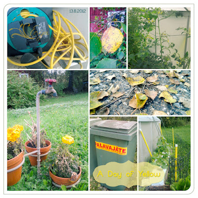
I'm continuing my week (or so) of colour for Beyond Layers.The first day was green, this one is yellow. On the 13 August, when Better Half had left for work, I was having my second or third cup of tea in the kitchen and staring at the yellow mug in front of me. I then realized there was a multitude of various shades of yellow all around me, and so, although I only have my phone to take photos with at the moment (see previous post), I was inspired to try and do this challenge by photographing yellow instead of digging it up from my archives.

And no, it really was no problem. It took me a little more than half an hour to walk around the house and the garden to get a shocking number of pictures with yellow. There were so many that in the end I was quite happy to see that quite a few of them were out of focus (note to self: keep your distance - mustn't try to get too close to the objects because the phone, without a macro function, will just blur the pics).

I thought it would be fun to collect them into storyboards to show as many as possible. In the end, I managed to squeeze the half-hour walk to three pages, one from the house, two from the garden - one with flowers, the other with… well, other things. Here they are.

A Day of Yellow - Outdoors

A Day of Yellow - Flowers


A Day of Yellow - Indoors


What I did with the photos was to process all of them in Camera Raw before placing them in the storyboard. After that I used a gradient layer (soft light) for each storyboard to even the colours a tad.

Resources used:
- templates by Miya J, myself and Margote
- gradients by Digital Phenom

What fun that was! Then off to tackle the next colour.

Friday, 10 August 2012

A Week of Colour


Beyond Layers, Week 9. This is a week of colour (for me, that is, most of the group already did this eight weeks ago). The challenge is to focus on photographing a certain colour every day for a week, or actually, five days. *AAARGH* if you'll excuse my expressing myself like this.

The big aaaargh here is that I lost my camera in Salzburg. Should I say, it went missing in action. I could even claim that an Allosaurus ate it. Don't really know what happened, really. I still have the camera, but it just won't work. We were in the Haus der Natur, the natural history museum, and as usual, I was snapping here and there, and then suddenly, after I had taken a picture of Better Half scratching the chin of a Tyrannosaurus skull and another one of the Allosaurus there, something happened. When I tried to switch the camera on again, the lens just came half-way out and got stuck. After that, it hasn't been working. After spending time in the suitcase on our two flights back from Salzburg, the lens had retracted again, but when I (hoping against hope) tried to switch it on again, it beeped of malfunction and that was it.

Then Better Half thought of the old camera that has just been sitting on the shelf for a few years, but it turns out something's wrong with it, too. Seems it has been gathering dust for too long to be operational anymore - I can see nothing on the display, and when I try to take a photo anyway, it's mostly black. So no solution there either. All I have now is my phone to take photos with, and I'm feeling seriously deprived.

So, I'll settle to digging into my archives for the photos instead of photographing especially for the purpose. Some people in the group had followed the example of Xanthe and created storyboards, I think I'll follow suit.

Green - Summer 2012
For this storyboard I decided to pick different kinds of green things (read: not to have plants all over the place) and restrict myself to things photographed this summer. The pictures were taken in Dunfermline, Lübeck, Salzburg, Vienna and, exotically, inside our car.

Resources used:
- template 09 by Isa
- scotch tape from Bruissements Lointains by Au coin de l'objectif
- splash mask from Doux Bruissements by Au coin de l'objectif
- font Blokletters Viltstift by LeFly Fonts
- font Chalkduster

As an afterthought I decided to post another green picture as well, just because I like the particular photo. And yes, it is a plant. I took it on 13 July of a Lady's Mantle growing in our garden. I love their tiny, gentle, light green flowers. Not a lot of processing this time, just adjusted the levels a tad, added the text and made the frame.

Lady's Mantle

Resources used:
- font Windsong by Bright Ideas
- font Bank Gothic Light

And now off to tackle the rest of the to-do things for today.

Thursday, 9 August 2012

More Black & White

So it has taken me a month to get to the second day of week nine at Beyond Layers. Oh well. There's a good, or to be precise wonderful reason, though. Better Half was on holiday, and we've been so busy during the past few weeks that I really have to wonder how we've managed it all. I still continue being busy with various dog show activities, but decided to snatch some time to get a little step forward on the course.

On day 18, Kim gave us advice on black & white conversion, and I absolutely fell for Adobe Camera Raw. Never knew something like that was included with Photoshop, but after practising with b&w for fun, I used it on going over a batch of photos that were to be posted on a dog show site. And oh, it made cropping and editing far quicker and easier. Instead of spending all of Tuesday on the photos, it took me only about three hours to go through the lot of them.

But here's what I've created while trying out Kim's techniques. All the pictures here have been processed in ACR, since the other techniques I already tried out in the previous post.

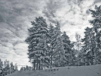
Pines, Clouds


It's cold enough today to warrant posting a winter photo... The photo was taken on Christmas Eve in 2010, and I thought b&w would add drama to the image. It sure did. Played with this in ACR and then added a blue gradient from the Super Dooper gradient pack by Digital Phenom.

Grape Hyacinth

Here's a picture I took in June in our garden. Was interested to see if one could create enough contrast between the blue and the green of the original image, and it worked pretty well. Again, I worked in ACR, but this time I added some texture as well.

Processing resources:
- texture Paper Love by Kim Klassen
- yet another blue gradient from the Super Dooper gradient pack by Digital Phenom
- font Saginaw Light
- font Capsuula by Henrich Fichna

Stone Lantern

Here's a lantern that stands on stones under our kitchen window. I like the b&w contrast, and the shapes it brought out.

Resources used:
- texture Aurora by Kim Klassen
- framing action Glass 50 px by Chain

Field Horsetail

There are these areas in the garden where we have a lot of Horsetail. I like it, the green in it is different from the grasses around it, it's lighter and brighter. In the original photo this was difficult to see, but here I'm pleased with how I managed to draw it into the  front with b&w.

Resources used:
- texture Happy Heart by Kim Klassen
- framing action Glass 50 px by Chain

Another fun assignment, this one. Looking forward to the next one.